IMAGES FOR MY CONTENTS PAGE
IMAGE ONE

BEFORE

How I edited this photo:

- I made the image portrait by cutting out some of the wall on the left and right, using the rectangular marquee tool.

- This was the result.

- I then added an "auto tone" effect to the image, which brightened it up a lot.

- This was the result.

- Next, I selected the "colour range" of the bricks on the wall, so that I could bring out this colour even more.

- I selected the wall colour using the colour picker, and then overlaid it again with 100% opacity to make the wall colour stronger.

- This was the final result, seen in Photoshop.
IMAGE TWO
 BEFORE


AFTER
How I edited this photo:

- I used the "auto tone" option to brighten up the image, similar to the first edit.

- I then used the spot healing brush to remove some blemishes from Matt's face.

- This was the result.

- I then selected the "colour range" of the brick wall...

- ...and overlaid it with its own colour with 100% opacity, to strengthen the colour.

- This is the final result, in Photoshop.
IMAGE THREE

BEFORE

AFTER
How I edited this photo:

- First of all, I used "auto tone" to try to brighten the image up.

- Then I used "auto colour" to try to make the colours look exactly right.

- Following this, I used the spot healing brush to remove some blemishes from Matt's forehead.

- This was the result (I wanted to keep it natural, so I just removed some of the biggest blemishes).

- Next, I selected the "colour range" of Matt's face, as it was in shadow and I felt it was too dark.

- I overlaid the shadow with the colour of his forehead (which was in the sun) in an attempt to make the rest of his face brighter.

- This was the final result.
IMAGE THREE


AFTER
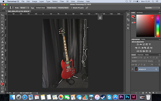
IMAGE FOUR

BEFORE

AFTER
How I edited this photo:

- First, I imported the photograph into Photoshop.

- Then I applied an "auto tone"...

- And an "auto contrast". I felt that this was all the image needed to bring out the black and red colours.
IMAGE FIVE

BEFORE

AFTER
How I edited this photo:

- First, I imported the photo into Photoshop.

- Then I used the "auto tone" effect, which I felt was all that was needed.
IMAGE SIX
BEFORE

AFTER
How I edited this photo:

- First, I imported the image into Photoshop.

- I then added an "auto tone" effect which got rid of the yellow tint and made the photo look sharp and natural.
IMAGES FOR MY FRONT COVER
IMAGE ONE
 BEFORE
 AFTER
AFTER
How I edited this photo:


 BEFORE

IMAGES FOR MY DOUBLE PAGE SPREAD
IMAGE ONE
 BEFORE
 AFTER
AFTER
How I edited this photo:


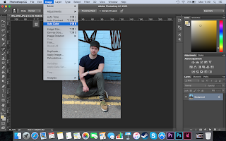


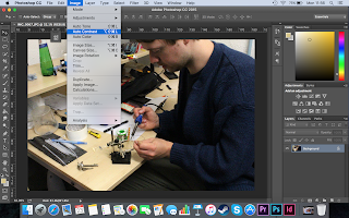


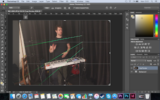


IMAGE ONE
 BEFORE


IMAGE ONE


How I edited this photo:

- I imported the photograph into Photoshop...

- Then I used the "auto contrast" effect. Not much was affected because the colours and brightness were pretty much right in the original image.
In the end I decided not to use the above image for my cover.
IMAGE TWO


AFTER
How I edited this photo:


- First, I imported the photo into Photoshop and applied an "auto contrast".

- This was the result - as you can see, the image is brighter and the colours are stronger.

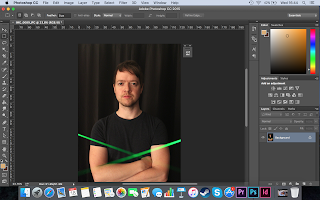
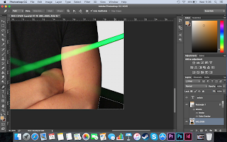
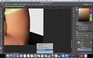
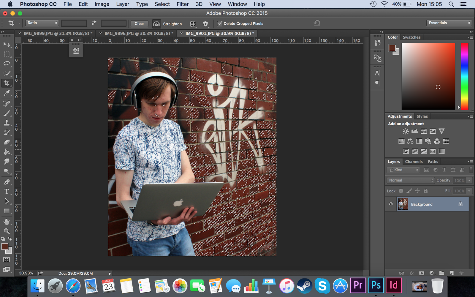
- Next, in order to remove the black background, I started to go around the black curtains using the Pen tool. This selected the black sections and then I deleted them.

- This shows me selecting the last black area of the image, ready to delete. I deleted all of the black sections because I wanted to place a better, textured background there instead.

- Finally, I added in a dark brick wall background. In this screenshot, you can see me changing the colour of a brick in the wall to yellow. To select the brick, I went over it with the Quick Selection tool, and then I coloured it using a yellow colour overlay with 75% opacity.
IMAGE ONE


How I edited this photo:

- First I imported the image into Photoshop...

- And used the "auto contrast" option on the image.
IMAGE TWO

BEFORE

AFTER
How I edited this photo:

- First, I imported the image into Photoshop.

- Then I added an "auto tone".

- I also added an "auto colour". These two enhancements solidify the colours in the photo and make it more striking.
IMAGE THREE

BEFORE

AFTER
How I edited this photo:

- First, I imported the unedited image into Photoshop.

- I then applied an "auto contrast", which brightened up the lighting in the photo.
IMAGE FOUR

BEFORE

AFTER
How I edited this photo:

- I imported the image into Photoshop...

- ...and then I cropped the image to remove some of the unwanted white wall. I also added an "auto contrast" after this.
IMAGE FIVE
 BEFORE


AFTER
How I edited this photo:

- First, I imported the original image into Photoshop.

- I then applied an auto tone effect, to make Josh's skin look a more natural colour and to brighten up the surroundings.

- Next, in order to make the background fully black, I used a combination of the Quick Selection Tool and the Pen Tool to cut around Josh's figure, before placing this on a new layer on top of a black background, the size of the double page spread. I also used the Flip Horizontal option to make Josh face the other way, as I thought this would work better for the double page spread - this way, I could have my writing on the right hand page.
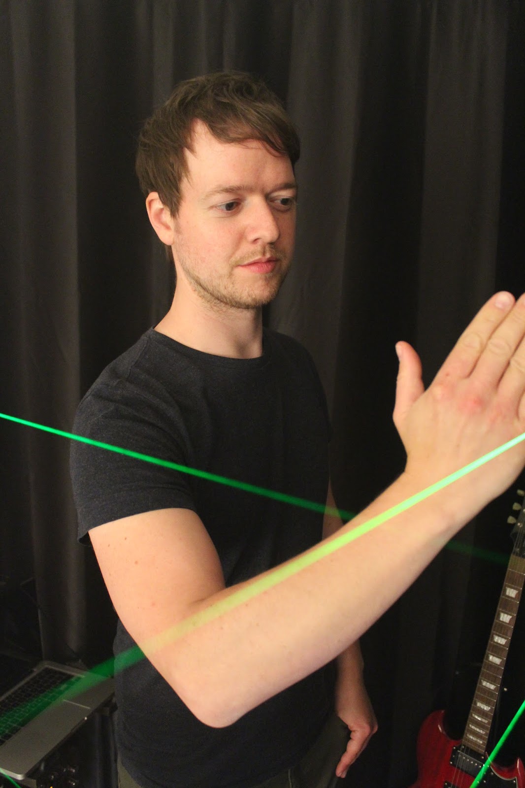
IMAGES FOR MY TITLE PAGE
IMAGE ONE


AFTER
How I edited this photo:

- After importing the image into photoshop, I cropped it so that it would fit an A4 page.

- Then, I added automatic tone, automatic contrast and automatic colour enhancements to the photo, found in the "Image" menu.

- Next, I selected the "colour range" of the bricks in the wall.
- I created a new layer containing just the bricks...

- ...and then gave them a colour overlay, with 50% opacity, using their own original colour. This strengthened the red of the wall.

- Finally, I used the spot healing brush to remove some spots from Matt's face.
No comments:
Post a Comment